Wednesday, June 26, 2019

Very Versailles With Distressing--#tgifc217

Over the last few months, I have come to understand where the expression about hounding someone originated.  Someone with dogs couldn't get away from them for a little peace and quiet.  My two pups are hounding me.  They are right on my heels.  I take a step back and I've stepped on a paw or two. I sit and stamp or type on my blog and I get a cold nose to my elbow (like just now!) or step on the smallest one who has decided she must lay by my feet under the chair.   Maybe this is why I felt in the mood to try some distressing on my card today--I needed de-stressing from all this too close doggy contact today!

It's TGIF Challenges time for me.  This week the challenge is ribbon ruffles.  I pulled out  my Pretty Peacock  scalloped linen ribbon, Very Versailles stamp set, and my Woven Threads designer series paper to create my card.


I picked out the Sahara Sand distressed paper pattern from the designer series paper and stamped on it with the word image in Sahara Sand and the leaf image in Pretty Peacock stamp off once.  Then I distressed the paper.  I first distressed the edges with the edge of my scissors, then spritzed the back side with a bit of water and crumpled it up.  I used Sahara Sand ink and a piece of Stamping sponge to ink the edges and along the crease lines created when I crumpled the paper.  I also distressed the edges of the Pretty Peacock layer and the greeting flags.  The layer under the greeting is a Terracotta Tile design from the designer series paper.  I put a piece of Tear & Tape adhesive down where I wanted my ribbon and and then laid the ribbon on it in a rufflely fashion.


There are some really fun and beautiful projects with ribbon and paper ruffles over on the TGIF Challenges blog here.  Be sure and check them out for plenty of inspiration.


It's been a while since I've done any distressing, but I see more in my near future.  I'm loving the vintage feel of several of the new stamp sets in the catalog and distressing gives things a bit of a vintage look.

Thanks for stopping by today!--Sara Nell


Wednesday, June 19, 2019

Pressed Petals Best Wishes--#tgifc216

The Pressed Petals Suite in the new Annual Catalog is one of my favorites.  I've always loved the vintage look of pressed flowers, and this suite carries that vintage look throughout each of the products in the suite.  I decided it was the perfect suite of products to pull out for this week's TGIF Challenges sketch challenge.


I started with a Crumb Cake card base and added a layer of Rococo Rose card stock that I embossed with the Scripty 3D embossing folder.  I added a strip of one of the wood grain patterns in the Pressed Petals specialty designer series paper pack. I sponged around the card base and the wood grain strip with Soft Suede ink and around the Rococo Rose layer with Rococo Rose ink.  I added a piece of the Rococo Rose gathered ribbon down the center of the wood grain strip. 

Next I added a floral piece which I fussy cut from another pattern in the Pressed Petals paper pack.  I sponged around the edges of this piece with Mossy Meadow ink.  Sponging the edges of fussy cut paper like this not only gives the piece a bit of dimension, but it also hides small errors in your fussy cutting.

I stamped the greeting from the Path of Petals stamp set, die cut it out with the smallest oval die in the Petal Labels dies, and then adhered it to the center of a frame die cut with another die from this set.  I sponged the edge of the petals on the frame with Soft Suede ink and then sponged the petals with Champagne Mist shimmer paint.  I wanted to recreate the shimmer from the gold metallic center of the ribbon.

There are some beautiful projects using this sketch over at the TGIF Challenges Blog here.


Thanks for stopping by!--Sara Nell


Wednesday, June 12, 2019

Hello, Friend--#tgifc215

The TGIF color challenge for this week is Night of Navy, Granny Apple Green, and Pool Party.  I've always liked blues and greens together, so this was a fun challenge.  I decided to combine the colors for a watercolor background invoking a pond-side scene:


For my background, I inked up Clear Block E with stripes of the challenge colors, spritzed it with water and then stamped it on Watercolor Paper.  I held the block in place for a few minutes  so the paper could absorb the ink and water.  You never know what you are going to get when you do this! 

To finish my little pond scene, I added a Granny Apple Green clump of plants and a Night of Navy butterfly die cut from the Well Written dies.  The "friend" in script is also from this die set.  I adhered 3 die cut words together for my card.  The "hello" is from the coordinating stamp set Well Said.  I added a Vellum card stock oval behind the scene to help it stand out a bit.  A fold of Granny Apple Green 1/2" textured weave ribbon at the top of the focal piece completes the card.

Head over to the TGIF Challenges Blog to see some fantastic projects using this fun color combo:


Thanks for stopping by!--Sara Nell
  

Wednesday, June 5, 2019

Free as a Bird Note Card Set--#tgifc214

The TGIF Challenges design team has been throwing some great challenges out to us the last few weeks.  This week we are challenged to create a card set. I decided I wanted to do something really simple:  a single image on a card front, a different image on each of 4 cards:


These images are all from the Free as a Bird stamp set.  I stamped them in Jet Black StazOn and colored them with watercolor pencils and an Aqua painter.  I used Old Olive, Calypso Coral, Early Espresso and Cajun Craze.  I added and shadow around each image with the Bermuda Bay pencil.  The images were stamped on 4-7/8" x 3-3/8" pieces of Shimmery White card stock and then layered on Whisper White Note cards.

What is a card set without a case? 


I created this one out of Calypso Coral card stock that I randomly stamped with the blossom image.  Then I used the now retired, but much loved, Envelope Punch Board to create my little envelope-shaped box.   I used the measurements for a 3-1/2" x 5" card, but added a second score line 1/2" outside the regular score line on all four sides.  The added score line created enough width to hold all four cards and the envelopes inside the box.  I added a tag with the bird image colored  as it was on the card and tied it on with Whisper White Polka Dot tulle ribbon.  The greeting on the tag was stamped in Early Espresso ink.  

Be inspired by wonderful card sets created for this challenge over at the TGIF Challenges Blog here.


Thanks for stopping by today!--Sara Nell


Sunday, June 2, 2019

Creation Station June Blog Hop--Unique Folds


Welcome to the June Creation Station Blog Hop!  We are a group of Stampin' Up! Demonstrators from around the world who hop every first Sunday of the month.  Our theme this month is Unique Folds.   Whether you've hopped in from our fantastic new design team member Martin Stone's blog or you are starting out here, I'm happy you stopped by.  You're bound to get a lot of inspiration this month, so be sure and click on the "Next" button at the end of each post to see each of the designer's projects.

Several month's ago, I saw a "double-fold" card created by Robin Shakor who is a project designer for another paper crafting company. I looked at her design and thought it would work well with our Memories & More card packs--so I kept her idea in the back of my mind as a possible project for this hop.   Then the new Annual Catalog pre-order happened and I bought all of the Come Sail Away Suite, including the new Memories & More cards.  The double fold card turned into a double fold cover on a waterfall mini album:


This mini album was going to be a surprise for my husband for Father's Day. However, after searching frantically for my photos of our adventures on Vahevala, I had to give up and ask him if he knew where I could find them.  A three-day search through 3 computers, numerous CDs and a couple of thumb drives yielded only a few, not so exciting photos. So, the surprise will happen when (not if) I find the photos in my box of printed photos.  (Hey, I had a flip phone back then!!!).

Here's my special creation for my Captain, sans pictures:


The album is 8" high, by 5" wide by 1/2" thick.  The extra thickness is to accommodate photos. I designed the size of the album around the 4" x 6" Memories & More cards and the standard size of printed photos.  I can use the full size photos this way and also crop them as needed.

Here's the double fold front feature.  It opens from the left.


*Please note:  I believe it is important to hand write all my journaling.


The large photo frame on the left is for a photo of Vahevala with sails up and sailing on Lake Martin, Alabama.  (I took a series of those--so I know I will find it!).  Here is a close up of the waterfall photo feature:


For those of you who are interested in how I made this album, here is the step-by-step (if you're not interested, just scroll on down to the "Next" button--this is a long post!):


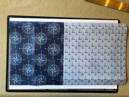
I started with one 10" high by 12" wide piece of designer series paper (the sail boat pattern) and one 10" high by 9-1/4" wide piece (the compass pattern).  I overlapped the compass pattern 2" on the left hand side (when looking from the outside cover side).  You need to be sure and check the orientation of your paper to make sure you don't have any upside down patterns.  Next you will turn your entire sheet over and score on three sides.  In the above photo, the un-scored side is on the left-hand side of the photo.  This will be the side that wraps around to the front of the mini album.


On the inside of the album, you will place chipboard:  2 pieces 8" x 5" (side pieces), 2 pieces 8" x 1/2" spines) and one piece 8" x 2" ( the front flap piece).  Line up the first side piece along the left-hand score line, then add each piece leaving a bit less than 1/8" gap.  Glue the pieces down with Multipurpose Liquid Adhesive.  


Next miter your edges as shown and add Tear and Tape adhesive as shown.


Close-up of flap edge cut.


Fold paper edges over chipboard and go over with a Bone folder.  The paper edges on the flap end should be glued down before adding Tear & Tape as shown. Fold the flap end down over the chipboard and go over it with a bone folder.


Cut a piece of designer series paper (this one is the Lighthouse pattern) to 7-3/4" high by 10-1/2" wide.  Again, check your paper orientation.  Adhere to inside with Multipurpose Liquid adhesive.  Next, take your bone folder and carefully score along the gaps between the chipboard pieces.  Carefully fold the book along the score lines.


To create the waterfall, cut 6 pieces of Whisper White card stock to 6-1/2" X 4-1/4"  Score at 1/4" along the top side.  I decided to use various patterns from the Come Sail Away designer series paper to cover the fronts of each of my cards (except the top one where I added a Memories & More card).  I cut them at 6-1/4" x 4-1/4" and adhered them with Multipurpose Liquid Adhesive.  They will serve as frames for the photos. (Once I decide on the photos I will be placing in the album, I may cover the back sides as well.)  After you finish covering your cards, use a bone folder to fold the flap back at the score line.  Add Tear & Tape adhesive to the back of the flap on each card piece.  Adhere your top card flap about 1/4" from the top of the album side.  Add each additional piece with the folded side against the bottom of the flap edge of the card just above it.  

Add a 4-1/4" x 6-1/4" piece of card stock to the other side of album to use as a frame for the main photo of your album.

For the folded piece on the cover of the album (see above), cut a piece of Night of Navy card stock  8-1/2" wide by 6-1/4" high.  Score at 4-1/4".  Add your Memories & More cards to the inside and journal as desired.  I used a piece of the newspaper print pattern paper  cut to 4" x 6" for the right-hand side of my piece.  Then I used sticker from the card pack, "Here's to making every moment count", and backed it with a piece of Night of Navy card stock that I trimmed to fit around the sticker using the Modern Label punch.


Add a 16" piece of ribbon to the center of the flap as shown, using Tear & Tape adhesive.  I used the linen ribbon in the Magnolia Land ribbon combo pack. 

Place several strips of Tear & Tape on the bottom fold side of the cover piece.  Remember that this piece will open from the left-hand side, so check the orientation of the cards in the center to make sure you do not put them on upside down.  Also, only about 1-/14" of the piece will be adhered to the flap side.


Once you have your cover piece adhered to the flap, adhere a 10" piece of ribbon to the front of the piece as shown. 


Lastly, add the Memories & More card to the cover of your top piece, using Tear & Tape adhesive to secure the ribbon.  I used a 4" x 6" piece of Balmy Blue card stock, embossed with the Subtle 3D embossing folder.  On top I adhered a laser cut card from the Come Sail Away Memories & More pack.  I added a greeting from the Sailing Home stamp set, heat embossed in white on Night of Navy card stock, and a stamped sailboat.  Both were die cut using the Smooth Sailing dies.

This was such a fun project to create, made easier with the Come Sail Away product suite and especially the Come Sail Away Memories & More card pack.

Now it's time to be inspired by Tanya Bell!


Thanks for stopping by!--Sara Nell, First Mate


Creation Station April Blog Hop—Heat Embossing

  Welcome to the Creation Station Blog Hop for April.  Our theme this month is Heat Embossing.   We’ll be sharing heat embossing techniques ...