Sunday, August 6, 2023

Creation Station August Blog Hop--Ombre Blending


 Welcome!  It is the first Sunday of the month and time for another Blog Hop from the Creation Station Design Team.  
We are an international group of Stampin' Up! Demonstrators who love to share projects and ideas with you based upon a monthly theme.  Our theme this month is Ombre Blending. Be sure and click on the "Next" link at the end of each blog post to get plenty of inspiration for your next project.

Ombre Blending is a great and fun way to create a background.  All you need to get started is Basic White card stock (#159276), Blending Brushes (#153611) and/or Small Blending Brushes (#160518), and, of course, ink pads in your choice of colors. Usually, I pick three distinct colors and blend them in relatively straight rows up my piece of card stock, but for my projects today, I blended colors a bit differently:


I used only shades of blue on each of my cards.  I blended my inks on the ocean card in uneven rows from light to dark to mimic the moving tides in the ocean.  For my space card, I started from two opposite corners and blended from dark to light to the center to form a galaxy.


The ocean card background is blended with Boho Blue, Misty Moonlight, Starry Sky and Night of Navy. The speckled images were stamped randomly on the background with Night of Navy ink.  The background was die cut using the largest Deckled Rectangles die (#159173). This was layered over a piece of Night of Navy card stock and then over the Basic White thick card stock base.

The stamped and die cut images, except the greeting, are from the Beauty of the Deep Bundle (#161237; includes the stamp set, #161233, and the die set, #161236).  The tall leafy plant was stamped in Misty Moonlight and colored with Misty Moonlight light and Boho Blue light Stampin' Blends.  The lacy coral was stamped in VersaMark on Night of Navy and embossed with White Stampin' Emboss powder.  The small wide coral was stamped in Calypso Coral, with the shaded parts colored with the Lemon Lolly dark Stampin' Blends.  The branch coral was die cut out of Pecan Pie card stock.  The fish was stamped in Starry Sky and colored with Calypso Coral Stampin' Blends. 

The greeting is from the Translucent Florals stamp set (#162243, coming in the September to December 2023 Mini Catalog).  It was stamped in Night of Navy on Basic White and die cut using a label die in the Gorgeously Made die set (#161202).  Six Boho Blue 2023-2025 In Color dots (#161620) complete the card. 


The galaxy card was inspired by the galaxy patterned paper in the Stargazing designer series paper pack (#161175).  The center of the galaxy is Boho Blue, with Night of Navy, Misty Moonlight and Azure Afternoon inks blended to the center from the opposite corners of the card stock.  The images from the Reach for the Stars stamp set (#161176) were stamped in Boho Blue and White Craft inks then dotted with a Wink of Stella Clear Glitter Brush (#141897).  The background was splattered with both the Night of Navy Stampin' Write Marker and the Wink of Stella glitter brush.  I attempted to get some photos showing how beautiful this card is with all of that glitter.   They don't do it justice, but here are a couple with a glimpse:


The greeting is from the Reach for the Stars stamp set.  It was stamped in Night of Navy on Basic White and die cut using a die from the Tailor Made Tags dies (#155563).  A bow of Starry Sky metallic woven ribbon (#159198) completes the card.  This card is now off to my 4-year old grandson, who already knows all of the planets.  Grandma can't wait until he is patient enough to learn to find favorite constellations in the night sky. 

Now let's head over to Rachel Traudt's blog, Naptime is Stamptime, to see her sure to be gorgeous ombre blending projects.


Have a great August!
--Sara Nell


Wednesday, August 2, 2023

Bold Thanks--#tgifc431

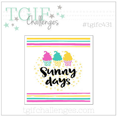
For the TGIF Challenges inspiration challenge this week, I picked out the colors, the stripes and the bold greeting from the inspiration piece to create this bold thanks card:


The stripes are 1/4" inch strips from Azure Afternoon, Berry Burst and Daffodil Delight card stock arranged on the Basic White card stock with 1/4" spacing.  The Berry Burst Branch was die cut using a die from the new Gorgeously Made dies (#161202).  The "Thanks" was stamped in Tuxedo Black Memento ink twice, then VersaMark ink and then heat embossed with Clear Stampin' Emboss powder to get a really bold look.  (You have to use a Stamparatus to get easy placement for the two layers of black and one of VersaMark.)  The greeting is from the Biggest Wish stamp set (#155052.

A Basic White thick card base, layer of Basic Black, and three black Classic Matte Dots (#158146) complete the card.


Have a great week!
--Sara Nell


Tuesday, July 25, 2023

Every Day An Adventure--#tgifc430

There is a theme challenge over at TGIF Challenges this week:  Travel.  That theme and thinking about a project for it was on my mind as I spent another day of my biggest project of the Summer--cleaning out my craft space.  Things have been piling up and not organized for a long while.  I was going through all my retired stamp sets, dies and punches and deciding what to keep when I came across the long retired On the Grow stamp set (#123077)  I love the little scooter image in the set because I have a love of Vespa scooters (mine is cherry red).  I decided to use it for my project today:


I paired my little classic colored Vespa with one of the meadow designs from the Masterfully Made designer series paper pack (#161192) and created my layers using the Deckled Rectangle dies (#159173).  I love this simple little card!

The Vespa image and greeting were stamped in Tuxedo Black Memento Ink (#132708) on Basic White card stock.  The Vespa was colored with Pecan Pie and Soft Sea Foam Stampin' Blends and the basket of wildflowers from the meadow with the following Stampin' Blends:  Pretty Peacock, Parakeet Party, Petal Pink and Sweet Sorbet.

The card base is Soft Sea Foam, the layer is Azure Afternoon and the ribbon is Sweet Sorbet metallic woven ribbon (#159200).


Every day is the perfect adventure! 
--Sara Nell

Wednesday, July 19, 2023

You Made My Day--#tgifc429

Back today with my entry in this week's TGIF sketch challenge.  Two weeks in a row--this is when I know I am getting back to my old self again!  


I am featuring the Cheerful Daisies Bundle (#161297) again this week.  The background is a set of three strips of designer series paper from the Fresh as a Daisy designer series paper pack (#161289) arranged on a piece of Lemon Lolly card stock.  The focal arrangement of three daisies was die cut using a single die from the die set and cutting it out using Basic White card stock for the base and Garden Green, Soft Sea Foam and Crushed Curry for the accent pieces which were trimmed and glued over the corresponding Basic White pieces.  The Crushed Curry flower centers were glued over a piece of Lemon Lolly card stock before fussy cutting them to fit over the the center of the flowers. The greeting was stamped in Pebbled Path on Basic White card stock then trimmed.  A bow of Linen Thread (#104199), three Pebbled Path 2023-2025 In Color Dots (#161620) and a card base of Pebbled Path complete the card.


Have you ever completed a sketch challenge?  It's a great way to help you grow as a stamper and have fun creating.

Have a great week!
--Sara Nell


Tuesday, July 11, 2023

Cheerful Daisies Birthday--#tgifc428

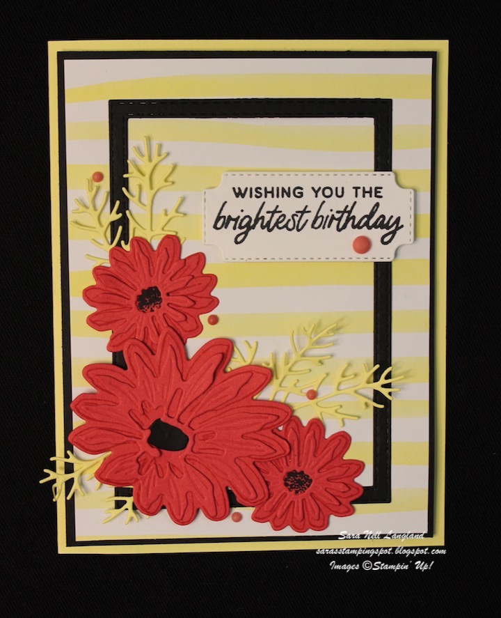
This week the TGIF Challenges team has a color challenge for us:  Lemon Lolly, Sweet Sorbet and Basic Black.  It's been a while since I've participated in a challenge, so it took a couple of false starts before my design idea turned into a card I liked!


This card was created using the Cheerful Daisies bundle (#161297, includes stamp set and coordinating dies).  I used Sweet Sorbet Classic and Tuxedo Black Memento inks for the daisies with die cuts out of Sweet Sorbet, Basic Black and Lemon Lolly.  The greeting was stamped in memento ink and die cut using the label die in the Cheerful Daisy die set.  The Lemon Lolly designer series paper used as the background is from the Bright & Beautiful 6" x 6" designer series paper pack.  The frame was die cut using two nested dies from the now retired Stitched Rectangles die set to coordinate with the stitched label die used for the greeting.  Five Sweet Sorbet retired 2022-2024 In Color Matte Decorative Dots complete the card.

Have a great week!
Sara Nell


Sunday, July 2, 2023

Creation Station July Hop--A Color Challenge


Welcome to the July Creation Station Blog Hop!
We've got a color challenge for you today.  Each designer on the team will be creating with one new Core color, one new In Color and White.  Be sure and click the "Next" link at the end of each blog.  You'll get to see each designer's blog and be inspired with new color combinations to use in your own projects.  I can't wait to be inspired by the other designers' color combos, too!


For my two projects today, I chose Wild Wheat for my new In Color.  I wanted to experiment with this new color as many are a little afraid of it.   My new core color is Berry Burst (which is actually an old favorite In Color returned to join the Brights color family).  I am really loving this color combination, although my husband said that Wild Wheat was an ugly color and I should use something else!  Please let me know what your position is in the comments.  


For this card I used the Season of Chic stamp set (#158810) and the coordinating Chic dies (#158815).  To add depth of color, I used watercolor wash technique on Fluid 100 Watercolor Paper (#149612).  I did a wash of Berry Burst for the background followed by a Berry Burst splatter created with a Berry Burst Stampin' Write Marker (Brights Assortment, #161696).  Over this was I layered a Wild Wheat grid die cut, followed by the blooms and leaves and greeting.  The blooms and leaves were die cut out of ombre washed scrap sheets of watercolor paper created by the addition of more water to the Berry Burst and Wild Wheat ink as it was brushed down the sheets. Three Wild Wheat Dots (2023-2025 In Color Dots, #161620) in the center of each bloom complete the card. 


For this note card, I wanted the focal image to be inked with Wild Wheat.  It took a little experimentation before Herb (my husband and card critic) to at least admit that the card was okay but would be better without Wild Wheat.  I really like it!  For this card I used the Nature's Prints stamp set (#158793) and coordinating Natural Prints dies (#158800).  For the background, I stamped the floral image in Berry Burst on Basic White card stock then layered a sheet of Vellum card stock (#101856) over it.  Then I added the die cut plant images.  Three Wild Wheat dots complete the card.

So, do you like Wild Wheat or do you share Herb's opinion?  Did I change your mind?  I have several other color combinations in mind that include Wild Wheat.  This modern neutral is growing on me! 

Now it is time to check out Denita's Blog and see what her color choices are for our hop today! 


Have a joy-filled day and, for those here in the United States: Happy Independence Day!

--Sara Nell


Sunday, June 4, 2023

Creation Station June Blog Hop--Beach Life


Welcome to the June Creation Station Blog Hop!

So glad you have joined us today as we interpret Beach Life with our stamping projects.  Be sure and click the "Next" link at the bottom of each of the design team members' posts so you can hop around and see all of our Beach Life themed projects. Our team includes artists with different styles and beach life experiences, so you are sure to be inspired today.


When I think of beach life, I think of my grandson who absolutely loves to go to the beach and dig in the sand, hunt for interesting things on the beach and, of course, head into the water with his daddy.  To celebrate Easton's love of the beach I created this page using photos from a cold February day on the beach.


The main colors on this page are two of our new In Colors, Pebbled Path and Boho Blue.  Accent colors are Gray Granite, the returning color Misty Moonlight, the new color Bubble Bath and another new In Color, Moody Mauve.  The stamps and dies are from the Seaside Bay stamp set (#160436) and coordinating Seaside Bay dies (#160444).  The netting die is from the Chic dies (#158815).  The page title was created with the Alphabest stamp set (#158884) and coordinating Best Label punch (#158885).


The page base was scored with three vertical lines on the left-hand side of the page and three vertical lines on the bottom half of the right-hand page.  You cannot tell from the photos that the seashells and crab were highlighted with the Wink of Stella Clear Glitter Brush (#141897) to give them that sparkly sand look.  Three Boho Blue dots from the 2023-2025 In Color Dots pack (#161620) were added to the page among the seashells and next to the crab. There is a strip of Boho Blue textured ribbon (#161631) under the photos.


My journaling is always hand-written.  My most treasured items are hand-written letters from both my parents.  My handwriting is not as beautiful as my mother's nor as hard to read as my father's, but it is still that personal connection that I want to leave behind.

Head on over to Denita Wright-Smee's blog to see her Beach Life project(s).  She is sure to inspire us with her creativity.


Wishing you many happy moments at the beach or wherever your happy place is this summer!
--Sara Nell


July Creation Station Blog Hop: Case The Catalog

  Hello!  Welcome to the Creation Station Blog Hop!  We are a team of Stampin' Up! Demonstrators from around the world who create a hop ...