Showing posts with label creation station. Show all posts

Sunday, February 4, 2024

Creation Station February Blog Hop--Sale-a-Brate Friendship


Welcome to the February, 2024, Creation Station Blog Hop. 
This month we are Sale-a-Brating friendship and highlighting Sale-a-Bration products you can earn free with a minimum $50 or $100 purchase.  Click on the Next link at the end of each blog post to see each designer's projects--you will probably decide that one or more of these free products are a "must have" for your future stamping projects. 


My friendship projects feature the Softly Stippled designer series paper (#162975) which is a Free with $50 purchase Sale-a-Bration product.  This paper coordinates with the Stippled Roses Bundle (#162667) in the current Mini Catalog and I have used the greetings and a leaf image from the stamp set and several dies from the die set in that bundle on my projects.  I have also used a couple of "hidden" gems from the Sale-a-Bration Brochure:  the Opaque Faceted Gems (#162979) and the Pool Party 5/8" crinkle ribbon (#162980), each free with a $50 purchase.  


This congratulations card has used two different texture patterns from the paper pack, one in Pool Party and the other in a light shade of Wild Wheat.  The Wild Wheat pattern was die cut using the Nested Essentials dies (#161597).  The lighter Wild Wheat leaves were die cut out of a textured Wild Wheat patterned paper and the darker, larger leaves out of Wild Wheat card stock.  The floral bud parts of the larger leaf die cuts were pieced with buds trimmed from identical die cuts made with Pecan Pie card stock. The flowers were die cut out of Pool Party card stock.  The greeting was stamped in Pecan Pie.  Pecan Pie faceted gems from the Sale-a-Bration gems pack, a piece of the Pool Party crinkle ribbon, a layer of Pecan Pie card stock and a Basic White Thick card base complete the card. 


This birthday card was created with two layers of patterns from the paper pack on a Wild Wheat card base.  The leaves were stamped in Wild Wheat on Basic White and die cut.  The background leaves were die cut out of Wild Wheat card stock.  The birthday greeting was stamped in Pebbled Path.  Pool Party faceted gems from the Sale-a-Bration gems pack complete the card.


This thank you note card features two patterns from the Softly Stippled Sale-a-Bration paper pack.  The background is a Calypso Coral roses pattern die cut with a Scalloped Contours die (#155560).  It is layered over a piece of Wild Wheat card stock adhered to the front of a Basic White note card.  The roses were fussy cut from another pattern in the paper pack.  The Pebbled Path rose cluster was colored using Watercolor Pencils Assortment 1 (#161700).  I used Calypso Coral for the roses and a combination of Daffodil Delight and Old Olive for the leaves.  The penciling was smoothed out with a barely damp Water Painter (#151298). The small background leaves were die cut out of Wild Wheat card stock.  The greeting was stamped in Pebbled Path.  Three Calypso Coral faceted gems from the Sale-a-Bration gems pack complete the card. 

Now click on the Next Button and head on over to Dani Dziama's blog Dani's Thoughtful Corner to see her projects.  I'm excited to see what she has created for us today!

Have a happy week!
--Sara Nell


Sunday, January 7, 2024

January Creation Station Blog Hop: Fuzzy & Furry


Welcome to the January, 2024, Creation Station Hop!  We are an international group of Stampin' Up! Demonstrators who hop every first Sunday of the month.  This month our theme is Fuzzy & Furry so get ready for some fun animal inspiration this month!

Be sure to click on the Next Button at the end of each post to hop around to each designer's blog.


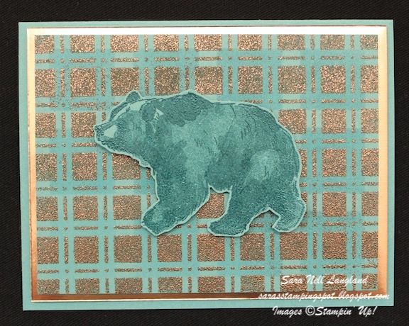
My fuzzy (?) and furry critter is the bear from the Wildlife Wonder stamp set (#157923).  I have used this bear on a lot of cards--especially masculine birthday cards, so I tried something different this time.  Still masculine, still a straightforward design, simple but with the two Artistic Mix decorative Masks (#159178) that create a plaid design and some fun texture.  I used the same color palette on both cards: Lost Lagoon, Pretty Peacock and Copper.  (I was going to use Copper Clay for the layer on both, then switched to Copper Foil in the end, not realizing it is retired. Copper Clay card stock looks great with this, too.) 


For the plaid on both cards, I used a blending brush (#153183) and Pretty Peacock ink with the large square mask for the first layer and then the small square mask and VersaMark ink to create the second layer.  I used Copper Stampin' Emboss powder (#155555, Metallics collection) with the VersaMark ink to heat emboss the second layer.  The bear was stamped in Pretty Peacock on Lost Lagoon card stock.


To create the plaid bear, I stamped the bear image over the plaid in VersaMark ink, heat embossed it with Clear Stampin' Emboss Powder (#155554, Basics collection), then fussy cut it out with my Paper Snips (#103579). The Lost Lagoon layer was embossed with the Timber 3D embossing folder (#156406).   I chose not to put a sentiment on either card.  I like the simplicity of just the image on the background. 

Next up is Dani Dziama, one of the talented 2024 Stampin' Up! Artisan Team members on the Creation Station Design Team.  I can't wait to see her fuzzy and furry design!  Head over to her blog, Dani's Thoughtful Corner, to be inspired.


Have a Very Happy 2024!
--Sara Nell


Sunday, December 3, 2023

Creation Station December Hop: Santa's Workshop


 Welcome to the December, 2023, Creation Station Blog Hop!!!

Our theme this month is Santa's Workshop.  Wow!  Lots of possibilities and I am sure you are going to get plenty of ideas and inspiration from this month's hop.  Be sure to click the "Next" link at the bottom of each post to hop around and see all of the ideas we are sharing today!


This Santa's Elf created a Christmas Match Game using the images in the Festive & Fun stamp set (#162078).  Doorbell, my grandson's Elf on a Shelf, is magically stopping by this week to take it to Easton at some point before Christmas!


There are two each of 5 designs. The cards are each 4-1/2" x 2-1/2".  The images were stamped in Tuxedo Black Memento ink and colored with Stampin' Blends.  After coloring, the cards were backed with the Copper Clay design from the  O Holy Night designer series paper pack (#161986).  I used a retired corner rounder punch to finish the edges of the cards.  Before Doorbell grabs the card box, each of these cards will be laminated to handle all the use by a 4 year old and his buddies.


The cards fit inside this box designed to look like a card deck box--only a bit bigger at 4-3/4"l x 2-3/4"w x 1/2"h.  It was created with Copper Clay card stock and the same pattern designer series paper as the backing on the cards.  A Copper Clay deckled circle (#162286)  was decorated with a fussy cut greeting and bird image from the Festive & Fun stamp set and a Shaded Spruce "tree" die cut with a die from the Gorgeously Made die set (#161202).  The box is closed with a piece of Copper Clay textured ribbon (#161629). I used a retired 1-1/4" circle punch to make the thumb notch in the front of the box and a retired corner rounder punch to round the corners of the box lid flap.  


Here is a sketched pattern for making the box.  It is 7" wide scored at 1/2", 3-1/4", 
3-3/4", & 6-1/2".  It is 6-3/4" high scored at 1/2", 5-1/4", 5-3/4".  It is also scored at 4-3/4" between the 3-3/4" and 6-1/2" vertical score lines.  The photo shows the scored lines as dashes and the cutting lines in pink highlighter.


Hope I've inspired you to check out your stamps to make your own little Match Game.  It will make a great stocking stuffer!

Now let's head over to Yvonne's blog, The Creative Teacup, and see what she has made to inspire us!


Wishing you a very blessed and merry holiday season!
--Sara Nell


Sunday, October 1, 2023

Creation Station October Blog Hop--Tricky Treats!


 Hello!  Welcome to the October Creation Station Blog Hop!  We are an international group of Stampin' Up! Demonstrators who hop on the first Sunday of each month.  Our theme this month is Tricky Treats.  We will be sharing ideas for your Halloween festivities this year.  We've got lots of fun ideas, so don't forget to click on the Next link at the end of each post.  You don't want to miss a great idea, tip or trick. 


My Tricky Treats are for my Grandson, Easton.  He 4-1/2 years old and is well and truly into Halloween.  I made him a Halloween banner and a couple of treat envelopes plus found him a great Halloween book.  Easton called the last set of Halloween banners I made him his "scary, spooky Halloween."  They stayed on his door for almost two years until they fell apart.  This banner is bigger and sturdier than the last set so I am sure it will be on his bedroom door for a while.


Easton loves skeletons.  Of course,  I had to make his banner and treats with the Them Bones Suite Collection (#162222), including the Bag of Bones stamp set and dies (Bundle, #162219), the Them Bones designer series paper (#162215) and the Glow-in-the-Dark Bats & Ghosts (#162220). I did not use the Glow-in-the-Dark specialty paper (#162221) in the suite on these projects.  All of my flags were made with designer series paper glued over pieces of Smoky Slate card stock for sturdiness.  The large flags are 3" x 5-1/2" and the small flags are 1-1/2" x 5". 
The fish tails were made by marking the center of the flag at 1" (large flags) or 3/4" (small flags) from the bottom of the flag and then cutting in from each edge to the mark. 


It is so easy just to have fun with these products!  So many ways you can dress up and change up these skeletons.  I had to include a dog and a cat skeleton because Easton loves his neighbors' two pets:  Raven the dog and Ghost the cat--how could they not be on a Halloween banner!!!  I chose colors from the designer series paper:  Basic Black, Starry Sky, Cajun Craze, Pumpkin Pie, Basic Gray plus Smoky Slate.  Each skeleton was stamped in VersaMark, heat embossed with White Stampin' Emboss Powder and die cut.  The ribbon tying the flags together is 1-2/3 yards of Black & White gingham ribbon (#156485) colored with a Pumpkin Pie Dark Stampin' Blends marker.  


The envelope treat holders were made with a Pumpkin Pie card stock base and covered with coordinating Them Bones paper patterns.  The tombstone and the Deckled Rectangle (#159173) were stamped in VersaMark, embossed with White Stampin' Emboss Powder, and decorated with the Glow-in-the-Dark ghosts and bats.


These treat envelopes are quick and easy to make.  For the base cut a 4" X 10-3/4" 
piece of card stock and score it at 1", 5-1/2", and 6-1/4".  Fold the bottom 1" piece up and adhere it to the base using Tear & Tape adhesive on each side.  To make a tab to slip into the 1" pocket: measure 1-1/4" up on each side of the top piece and make a pencil mark.  Then measure and mark 3/4" in from each side.  Cut off the triangle formed between the two marks.  

Next up is Barb Pfeffer over at justBstamping.  Check out her Tricky Treats by 
clicking on the link below.  You are sure to be inspired by Barb's projects!


Have a "Spooky, Scary Halloween"!
--Sara Nell


Sunday, September 3, 2023

Creation Station September Blog Hop--Monochromatic


It's the first Sunday of September and that means another Creation Station Blog Hop!  Welcome, I am so glad you have joined us today.  Our theme this month is Monochromatic projects using just one color or what I call "buddy colors"--the same color in different hues.  Be sure and click on the Next link at the end of each designer's post, so you can be inspired by each of our creations today.


For this hop, I thought long and hard about my color scheme.  I couldn't decide on a color and then thought, "How about Neutrals?"  One would be in browns--Gray Granite, Pebbled Path and Early Espresso--and the other would be in grays--Smoky Slate, Basic Gray and Basic Black.  As you can see in the photo, the browns made it and the grays got kicked off the line-up.  My gray project looked too much like one of last month's projects, so I pivoted to Lost Lagoon and it's buddy, Pretty Peacock, for a quick, fun and easy project using the Masterfully Made suite.


This brown project was fun and challenging to do (and even more challenging to photograph).  Each of the browns I chose has a gray rather than a yellow undertone.  I spent a bit of time trying different combinations with the daisy petals and colors before I liked the combination.  The background is Basic White embossed with the Timeworn Type 3D embossing folder (#156505), sponged lightly with Gray Granite ink before putting it through the Cut & Emboss Machine.  It is layered with a frame of Early Espresso die cut using two Deckled Rectangles dies (#159173).  The daisies were stamped and die cut using the Cheerful Daisies stamp set (#161290) and the Cheerful Daisies dies (#161296, or bundled with the stamp set at 10% off, #161297). I used the large die with the three daisies to die cut the image first in Early Espresso, then followed with parts of the same die cut in Pebbled Path, Gray Granite and Basic White.  I layered the Pebbled Path die cuts over the small daisies and the Gray Granite over the leaves, and cut out the centers of the Basic White to use with each daisy.  I stamped and die cut the single flower dies and layered them under each corresponding flower in the trio and die cut the overlay of each to layer over the daisies and daisy centers.  The bouquet was finished with the stems die cut in Gray Granite and some Pebbled Path 2023-2025 In Color Dots (#161620).  

The greeting is from the Cheerful Daisies stamp set.  It was stamped in Early Espresso on Basic White and die cut using the label die in the Gorgeously Made dies (#161202).  The card was finished with a Basic White Thick card base and a layer of Early Espresso.


I cannot emphasize enough how fun and easy it is to make beautiful cards with the Masterfully Made Suite.  I used the Gorgeously Made stamp set and die bundle (#161203) and the Masterfully Made designer series paper (#161192).  The background paper design in Lost Lagoon and Pretty Peacock was die cut with a Deckled Rectangle die and layered over a piece of Lost Lagoon card stock and a Basic White card base.  The paper design creates built-in texture on which to adhere the Basic White and Lost Lagoon die cut plants.  The greeting was stamped in Pretty Peacock on Basic White and die cut using the same label die as on my first card. The card is finished with a bow of Lost Lagoon Bordered Ribbon (#161171) and some white Classic Matte Dots (#158146).  

Head over to Vicki Boucher's Blog by clicking the link below.  I can't wait to see what she has created for us this month!


Have a great day!
--Sara Nell


Sunday, August 6, 2023

Creation Station August Blog Hop--Ombre Blending


 Welcome!  It is the first Sunday of the month and time for another Blog Hop from the Creation Station Design Team.  
We are an international group of Stampin' Up! Demonstrators who love to share projects and ideas with you based upon a monthly theme.  Our theme this month is Ombre Blending. Be sure and click on the "Next" link at the end of each blog post to get plenty of inspiration for your next project.

Ombre Blending is a great and fun way to create a background.  All you need to get started is Basic White card stock (#159276), Blending Brushes (#153611) and/or Small Blending Brushes (#160518), and, of course, ink pads in your choice of colors. Usually, I pick three distinct colors and blend them in relatively straight rows up my piece of card stock, but for my projects today, I blended colors a bit differently:


I used only shades of blue on each of my cards.  I blended my inks on the ocean card in uneven rows from light to dark to mimic the moving tides in the ocean.  For my space card, I started from two opposite corners and blended from dark to light to the center to form a galaxy.


The ocean card background is blended with Boho Blue, Misty Moonlight, Starry Sky and Night of Navy. The speckled images were stamped randomly on the background with Night of Navy ink.  The background was die cut using the largest Deckled Rectangles die (#159173). This was layered over a piece of Night of Navy card stock and then over the Basic White thick card stock base.

The stamped and die cut images, except the greeting, are from the Beauty of the Deep Bundle (#161237; includes the stamp set, #161233, and the die set, #161236).  The tall leafy plant was stamped in Misty Moonlight and colored with Misty Moonlight light and Boho Blue light Stampin' Blends.  The lacy coral was stamped in VersaMark on Night of Navy and embossed with White Stampin' Emboss powder.  The small wide coral was stamped in Calypso Coral, with the shaded parts colored with the Lemon Lolly dark Stampin' Blends.  The branch coral was die cut out of Pecan Pie card stock.  The fish was stamped in Starry Sky and colored with Calypso Coral Stampin' Blends. 

The greeting is from the Translucent Florals stamp set (#162243, coming in the September to December 2023 Mini Catalog).  It was stamped in Night of Navy on Basic White and die cut using a label die in the Gorgeously Made die set (#161202).  Six Boho Blue 2023-2025 In Color dots (#161620) complete the card. 


The galaxy card was inspired by the galaxy patterned paper in the Stargazing designer series paper pack (#161175).  The center of the galaxy is Boho Blue, with Night of Navy, Misty Moonlight and Azure Afternoon inks blended to the center from the opposite corners of the card stock.  The images from the Reach for the Stars stamp set (#161176) were stamped in Boho Blue and White Craft inks then dotted with a Wink of Stella Clear Glitter Brush (#141897).  The background was splattered with both the Night of Navy Stampin' Write Marker and the Wink of Stella glitter brush.  I attempted to get some photos showing how beautiful this card is with all of that glitter.   They don't do it justice, but here are a couple with a glimpse:


The greeting is from the Reach for the Stars stamp set.  It was stamped in Night of Navy on Basic White and die cut using a die from the Tailor Made Tags dies (#155563).  A bow of Starry Sky metallic woven ribbon (#159198) completes the card.  This card is now off to my 4-year old grandson, who already knows all of the planets.  Grandma can't wait until he is patient enough to learn to find favorite constellations in the night sky. 

Now let's head over to Rachel Traudt's blog, Naptime is Stamptime, to see her sure to be gorgeous ombre blending projects.


Have a great August!
--Sara Nell


Sunday, July 2, 2023

Creation Station July Hop--A Color Challenge


Welcome to the July Creation Station Blog Hop!
We've got a color challenge for you today.  Each designer on the team will be creating with one new Core color, one new In Color and White.  Be sure and click the "Next" link at the end of each blog.  You'll get to see each designer's blog and be inspired with new color combinations to use in your own projects.  I can't wait to be inspired by the other designers' color combos, too!


For my two projects today, I chose Wild Wheat for my new In Color.  I wanted to experiment with this new color as many are a little afraid of it.   My new core color is Berry Burst (which is actually an old favorite In Color returned to join the Brights color family).  I am really loving this color combination, although my husband said that Wild Wheat was an ugly color and I should use something else!  Please let me know what your position is in the comments.  


For this card I used the Season of Chic stamp set (#158810) and the coordinating Chic dies (#158815).  To add depth of color, I used watercolor wash technique on Fluid 100 Watercolor Paper (#149612).  I did a wash of Berry Burst for the background followed by a Berry Burst splatter created with a Berry Burst Stampin' Write Marker (Brights Assortment, #161696).  Over this was I layered a Wild Wheat grid die cut, followed by the blooms and leaves and greeting.  The blooms and leaves were die cut out of ombre washed scrap sheets of watercolor paper created by the addition of more water to the Berry Burst and Wild Wheat ink as it was brushed down the sheets. Three Wild Wheat Dots (2023-2025 In Color Dots, #161620) in the center of each bloom complete the card. 


For this note card, I wanted the focal image to be inked with Wild Wheat.  It took a little experimentation before Herb (my husband and card critic) to at least admit that the card was okay but would be better without Wild Wheat.  I really like it!  For this card I used the Nature's Prints stamp set (#158793) and coordinating Natural Prints dies (#158800).  For the background, I stamped the floral image in Berry Burst on Basic White card stock then layered a sheet of Vellum card stock (#101856) over it.  Then I added the die cut plant images.  Three Wild Wheat dots complete the card.

So, do you like Wild Wheat or do you share Herb's opinion?  Did I change your mind?  I have several other color combinations in mind that include Wild Wheat.  This modern neutral is growing on me! 

Now it is time to check out Denita's Blog and see what her color choices are for our hop today! 


Have a joy-filled day and, for those here in the United States: Happy Independence Day!

--Sara Nell


Sunday, June 4, 2023

Creation Station June Blog Hop--Beach Life


Welcome to the June Creation Station Blog Hop!

So glad you have joined us today as we interpret Beach Life with our stamping projects.  Be sure and click the "Next" link at the bottom of each of the design team members' posts so you can hop around and see all of our Beach Life themed projects. Our team includes artists with different styles and beach life experiences, so you are sure to be inspired today.


When I think of beach life, I think of my grandson who absolutely loves to go to the beach and dig in the sand, hunt for interesting things on the beach and, of course, head into the water with his daddy.  To celebrate Easton's love of the beach I created this page using photos from a cold February day on the beach.


The main colors on this page are two of our new In Colors, Pebbled Path and Boho Blue.  Accent colors are Gray Granite, the returning color Misty Moonlight, the new color Bubble Bath and another new In Color, Moody Mauve.  The stamps and dies are from the Seaside Bay stamp set (#160436) and coordinating Seaside Bay dies (#160444).  The netting die is from the Chic dies (#158815).  The page title was created with the Alphabest stamp set (#158884) and coordinating Best Label punch (#158885).


The page base was scored with three vertical lines on the left-hand side of the page and three vertical lines on the bottom half of the right-hand page.  You cannot tell from the photos that the seashells and crab were highlighted with the Wink of Stella Clear Glitter Brush (#141897) to give them that sparkly sand look.  Three Boho Blue dots from the 2023-2025 In Color Dots pack (#161620) were added to the page among the seashells and next to the crab. There is a strip of Boho Blue textured ribbon (#161631) under the photos.


My journaling is always hand-written.  My most treasured items are hand-written letters from both my parents.  My handwriting is not as beautiful as my mother's nor as hard to read as my father's, but it is still that personal connection that I want to leave behind.

Head on over to Denita Wright-Smee's blog to see her Beach Life project(s).  She is sure to inspire us with her creativity.


Wishing you many happy moments at the beach or wherever your happy place is this summer!
--Sara Nell


July Creation Station Blog Hop: Case The Catalog

  Hello!  Welcome to the Creation Station Blog Hop!  We are a team of Stampin' Up! Demonstrators from around the world who create a hop ...